Twenty years in, we’ve done something we’ve never done before. We’ve rebuilt ourselves from the inside out.
It’s not a facelift, it’s the result of honest conversations with our team about who we are, what we stand for and what kind of studio we want to be for the next twenty years. It started at our Team Connect Days, where the people who make Arch what it is sat down together and worked through the things that actually matter. What came out of those conversations became the foundation for everything you see now.
Why now?
Twenty years felt like the right moment to be deliberate. We have grown from two people and enormous Apple Macs in a spare bedroom into a team of sixteen delivering brand, digital, motion, social and growth work for ambitious organisations across the UK and beyond. The original Arch brand carried us a long way. But the business it represents has moved on, and it was time our brand caught up.
A Better World.
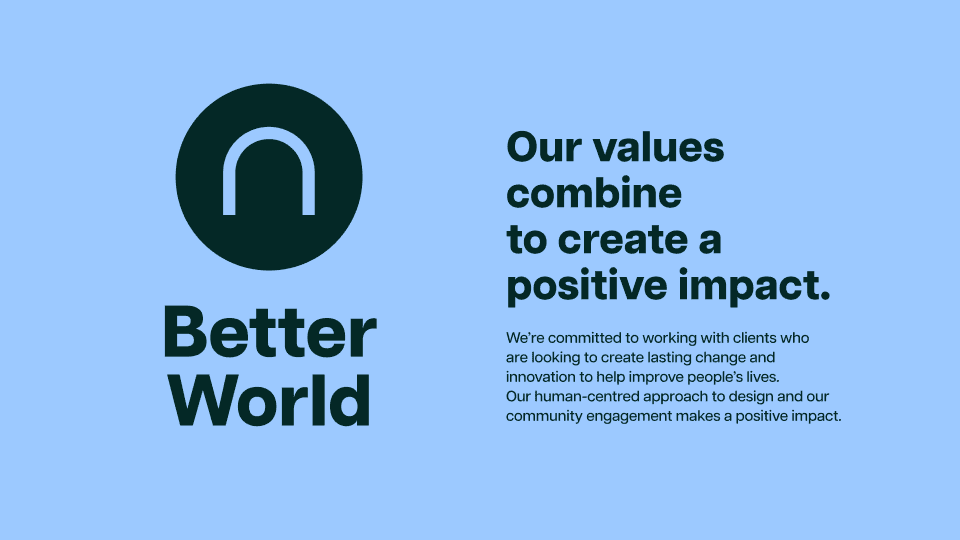
At the heart of the new Arch is something that has always been true for us, even before we had the words for it. Every brand we build, every campaign we run and every community project we lead is in service of something bigger than a deliverable. We want our work to make things genuinely better for the people it reaches. That is not a marketing line, it’s the reason we show up.
‘A Better World’ is our purpose, and it sits at the centre of everything else.
The Arch Way.
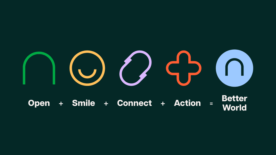
From that purpose came five brand values that work together as a pathway. We call it The Arch Way.
Open. Smile. Connect. Action. Better World.
Open means we’re approachable, transparent and honest with our clients, with each other and about our own work. Smile means we bring joy, enthusiasm and a genuinely human touch to everything we make. Connect means we build real relationships, the collaborative and lasting kind. Action means we get things done, decisively and without waiting for someone else to make the first move.
The look and feel.
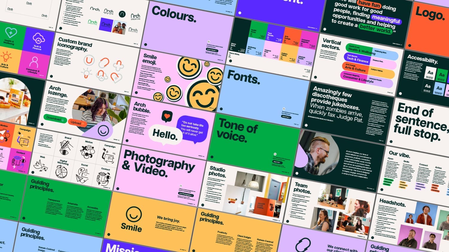
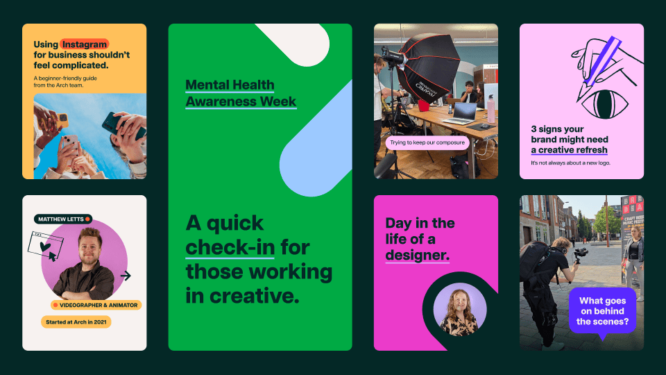
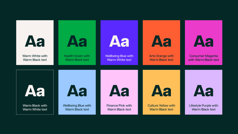
The new brand is bold and confident, which is exactly what twenty years of craft and experience earns you the right to be. Oversized, dynamic headings. Clean, decisive typography in Articulat CF. A rich colour palette mapped to our four sectors, Health and Wellbeing, Tech and Finance, Arts and Culture, and Consumer and Lifestyle, each with its own colour pairing so everything we make feels considered and intentional.
The Arch Window, the Lozenge and the Bubble are the graphic devices that give the brand its warmth and flexibility without losing structure. They are what let us shift from a premium client brochure to a social asset to an internal team moment, without ever feeling inconsistent.
Accessible by design.
Accessibility was never a chapter we added at the end. It runs through the whole brand. Every colour combination meets accessibility standards for contrast. Every layout decision considers diverse users. We design for different languages, abilities, cultures and contexts, and we always have. The new brand simply makes that commitment visible.
Tone of voice.
How we write matters as much as how we look. Our tone reflects The Arch Way, open, positive, collaborative and proactive, always with purpose. Clear over clever. Human over corporate. Enthusiastic without being exhausting. If a sentence could have been written by committee, it does not belong in our world.
Illustrations, photography and icons.
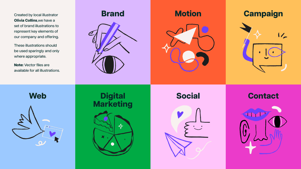
The brand includes a full suite of icons, one for each vertical sector, plus the five Arch Way value icons and the Better World mark. Custom iconography is built from the Arch curve, the shape at the heart of our logo that gives the whole identity its coherence. Illustration, photography and video direction are still in development, extending the system and giving the brand the full range of creative expression it deserves.
The Brand Book.
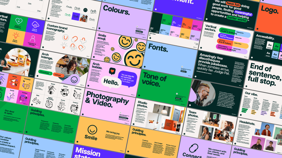
All of this lives in our new Brand Book, a living document that gives everyone who works with Arch, inside the studio and out, a clear and confident guide to how we show up. It covers our values, mission, logo, colours, icons, fonts, graphics, tone of voice, illustration and photography. It is the definitive reference for the Arch Creative brand, and it will keep evolving as we do.
The twenty year anniversary mark.
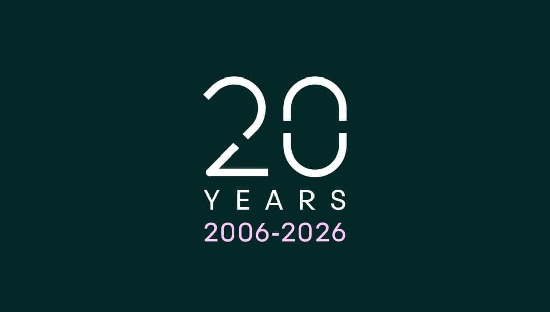
Sitting alongside our primary logo is a bespoke anniversary mark created for this moment. It shares the same visual DNA as the Arch Creative wordmark, the same curves, the same weight, the same family, while giving our twentieth year its own identity. You will see it across our 20 campaign, marking a chapter we are hugely proud of.
What comes next?
We’re not launching this and stepping back. The new brand is the start of a sustained period of growth, in our work, our team and the reach of what we do. Bloom, our proprietary growth programme, is part of that. Our new website is part of that. This Brand Book is part of that.