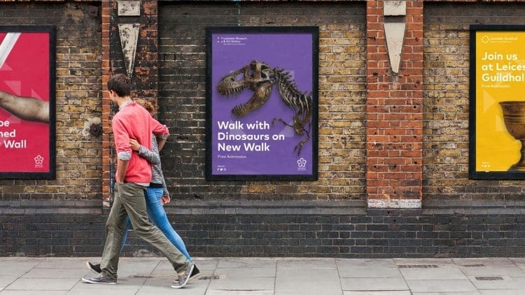

Leicester City Council’s museums service appointed Arch Creative to design a new branding approach for Leicester Museums & Galleries.
We were briefed to develop a distinct brand identity for each of the six museum sites in its portfolio, as well as an umbrella logo. Our response had to satisfy the following criteria:
View our case study video below to see what we did.
Leicester is one of the oldest cities in England, with a history going back at least two millennia, including being occupied by the Romans for more than 400 years. As such Leicester Museums and Galleries covers a rich tapestry of content across its diverse portfolio of sites. In particular, it’s flagship museum on New Walk, offers a vibrant collection of curiosities. Permanent exhibits include Dinosaurs, Egyptians, Minerals of Leicestershire and a wild-space area featuring taxidermy animals from around the world.
We carried out site surveys across all of the sites and it was recognised that mosaics and colourful ornate tiles are featured across all of the museums in the portfolio. We developed our branding concept using mosaics as a metaphor for one individual aspect of content available in the collections – from Roman history to German Expressionist Art. Each singular piece of mosaic is unique and hand-made, combining art, craftsmanship and sculpture. When each piece of mosaic, all different in colour and tone, is brought together and assembled, they are beautiful, but more importantly they begin to tell a story. Working together, they are connected and stronger – the whole is greater than the sum of its parts. Leicester, as a city, is in itself a melting pot; a cultural and social mosaic, so the use of mosaic as a visual metaphor reflects Leicester’s heritage and diversity.

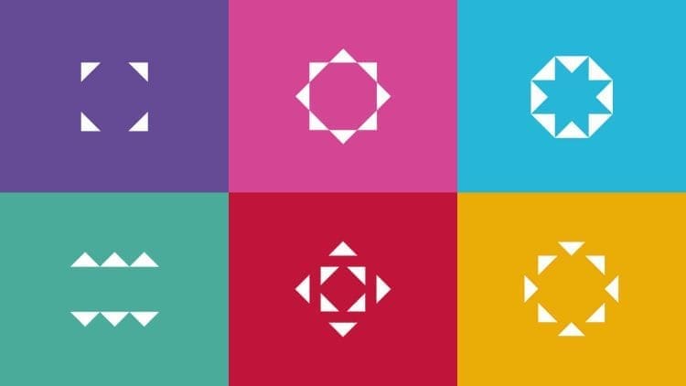
For each of the six museums we’ve highlighted elements from each venue through the use of the mosaic format, clearly giving each their own identity, whilst ensuring they all look and feel like part of the same family. The umbrella identity has taken the base colour from each of the six logos and combined them in one unified design.
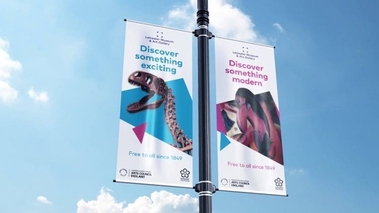
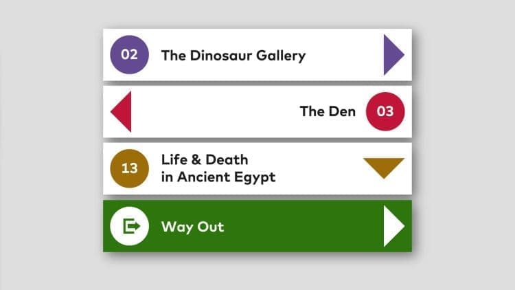
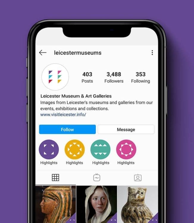
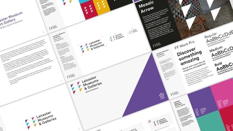
The mosaic arrow is flexible and has been used in a number of different ways through the comms, including a simple directional arrow for way finding and highlighting certain artefacts, words and rooms. We also developed brand guidelines and a visual framework around the mosaic arrow which has been incorporated into new designs for the What’s On Brochure, exterior banners, videos, social media, a range of merchandise and a new website:
“Our museums felt disconnected, but Arch have cleverly managed to created an identity for our portfolio of museums which look and feel like they belong together, and will encourage people to explore our other museums. We’re so pleased with the finished results, and even the V&A Design Museum, Dundee tweeted about how good the branding was.”
Joanna Jones
Head of Arts, Museums, Festival and Events
