
The Goodwood Estate in Chichester has been owned and operated by the family of the Duke of Richmond and Gordon for over 300 years.
Every generation brings something new to the estate, and in the modern era, the Duke has transformed Goodwood into a mini town based on sports and leisure. Luckily for us, the Duke and his team also appreciate the power of branding.
Famed for its motorsports and horse racing, Goodwood welcomes hundreds of thousands of guests every year – and those guests get hungry. Arch Creative were approached by Goodwood to develop six distinct brands for the variety of concessions offered to the estate’s visitors.
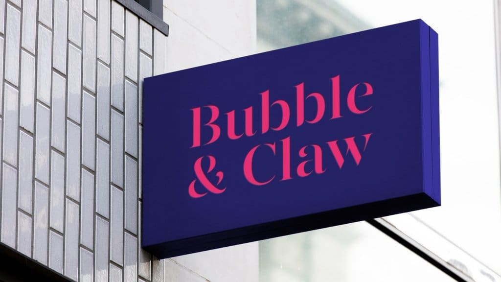
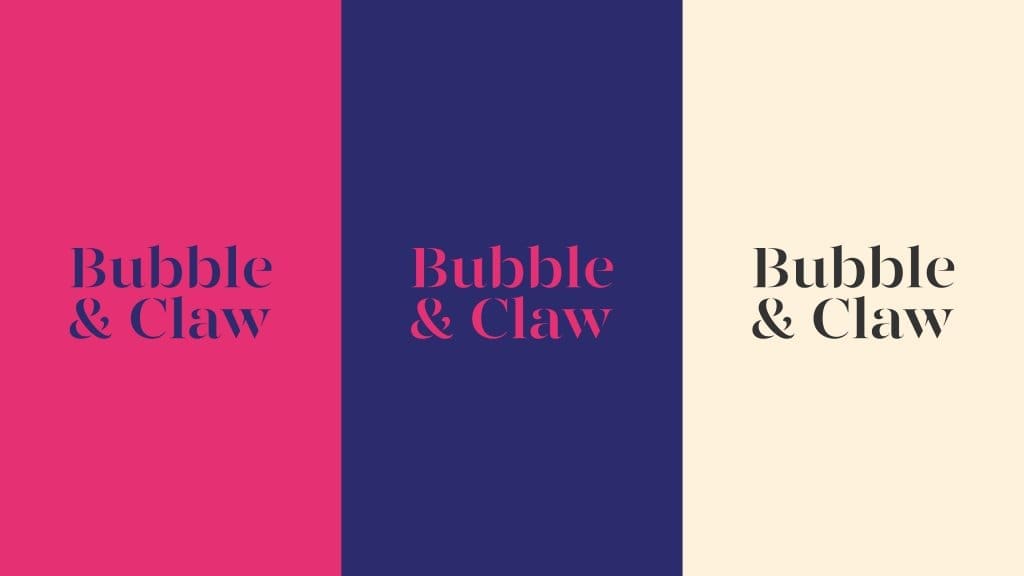
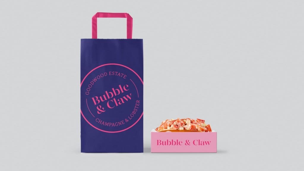
Serving the best lobster with the best champagne, Bubble & Claw is the epitome of food at Goodwood. Our branding captured the elegance of the food they serve, whilst keeping in mind the nautical source. A colour palette of deep navy and quirky magenta reflects a sense of history and tradition mixed with modern eccentricity – the perfect blend for the brand.
A repeated pattern based on the mesh of a lobster trap runs through the branding, whilst the central image is a crosshatch-style, anatomical drawing of (you guessed it) a lobster. Our chosen font brings to mind high-class eateries – simple, smart and elegant.
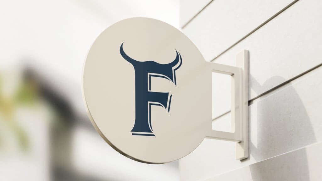
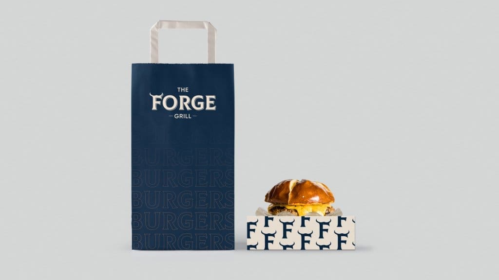
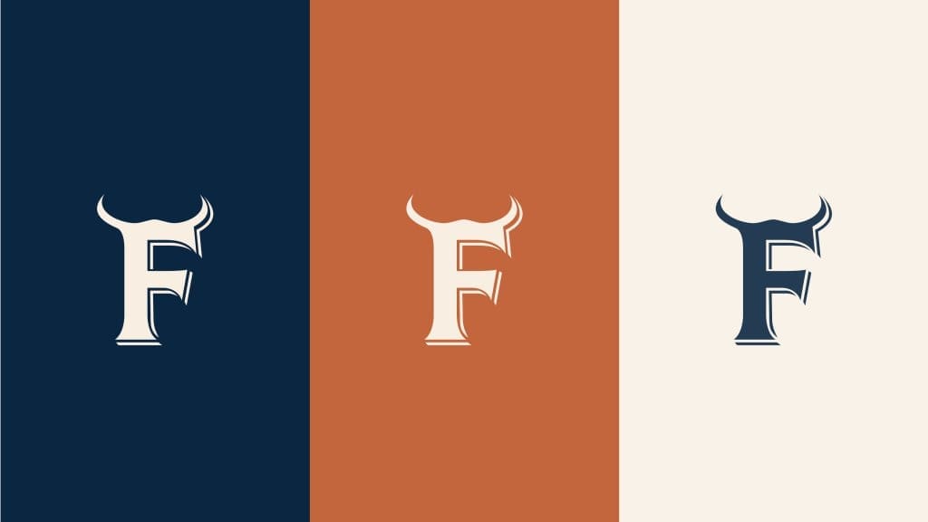
The Forge Grill is what it says on the tin: a grill house, specialising in burgers. The signature icon we designed for the restaurant is a capital F with horns. A horned stamp brings to mind a fiery devil, the flames grilling the perfect burger, and a bull – a signifier of the premium beef The Forge uses in between their delicious buns.
As a whole, the logo looks like a cattle brand – another nod to the brilliant beef they use. It works perfectly when carved into wood, burnt onto other material or printed on the menu. This is a rough and ready brand, but still maintains the classy quality you expect from Goodwood concessions.
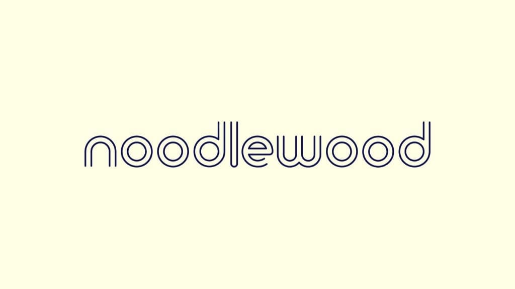
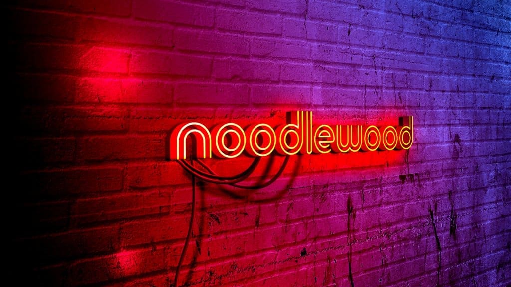
Who doesn’t love noodles? Taking inspiration from traditional Japanese art styles, mixed with the neon and simplicity-focused designs of modern Tokyo, Noodlewood tastes great before you’ve even had your first bit.
The font and brand pattern also brings to mind the swirling shapes of the noodles you’re about to eat, whilst keeping hold of that meticulous design which is so pleasing on the eye. The brand logo incorporates the N and the W of Noodlewood in an intricate, contemporary motif.

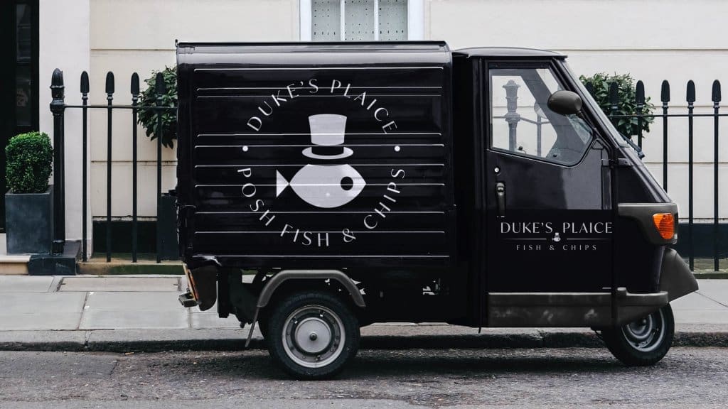
How do you show that a chippy is upmarket? Simple – you put a fish in a hat on the logo. Duke’s Plaice needed the right imagery and font to match the humorous pun in its name and the fact that this isn’t your ordinary fish and chips.
Using a slightly seriffed logotype paired with the heartwarming little fish logomark, the branding completely works to cover all of the potentially clashing sensibilities of the restaurant.
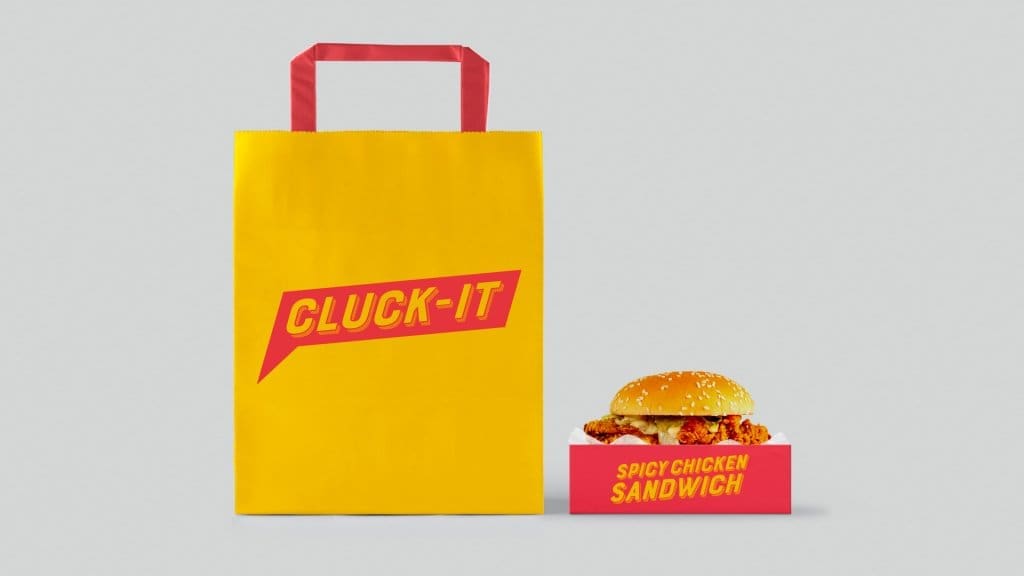
Using a pop art style speech bubble and an angular chicken, we created a brand identity for Cluck It that complimented it’s risqué naming convention. The red and yellow colour palette bring to mind other famous (or infamous, if you like) fast food chains, plus create the impression that the Cluck-It logomark is the brand of some sort of chicken-based superhero!
Cluck-It’s chicken brand comes through before you’ve even seen the menu. You’re here for street food style chicken burgers and wings, and this is a brand that’s delivering that based purely on it’s look-and-feel.

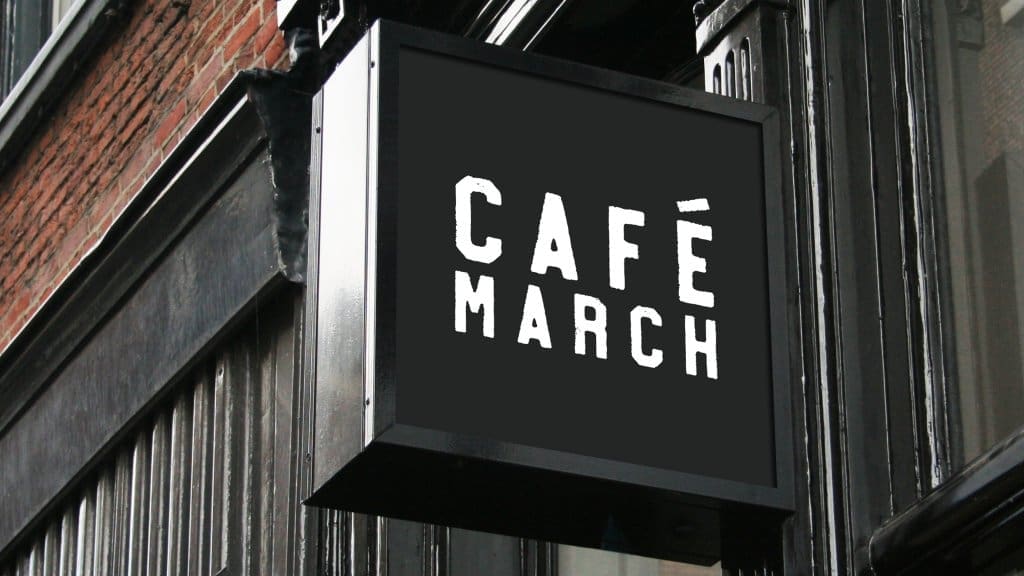
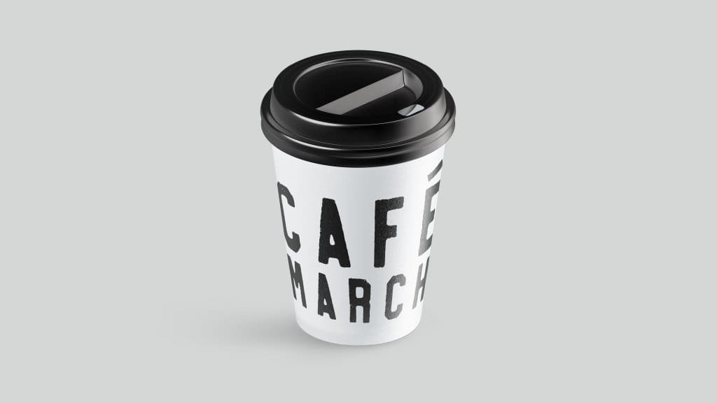
Calling to mind the indie London/NY coffee shop aesthetic, Cafe March has those caffeine-addicts salivating before they can even smell the beans. The logotype’s printed style gives the brand the authentic, artisanal look that coffee-lovers associate with their favourite beverage.
The black and white simplicity of Cafe March creates a brand value – this is coffee, exactly how you want it, no nonsense and no judgement. It tells the customer that this coffee is going to get to you quickly, but it’s also going to be delicious.
