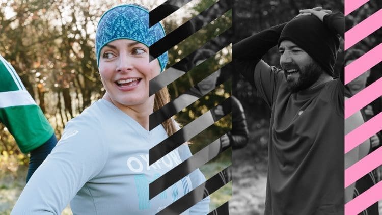

We were briefed to develop a campaign encouraging sign ups for British Triathlon’s Core membership. This involved a sub-brand name, visual identity and video concepts.
The main challenge was how to get people who were already club members to see the value in signing up for Core membership.

To counter this we needed to:


In order to create an engaging and memorable campaign, we created a strong sub-brand campaign name and identity to stand alone, but work within the British Triathlon brand guidelines.
The emphasis was on how individuals play their part in a much wider vibrant community, and improve their health and wellbeing. We looked to show how membership fees make a real difference to supporting clubs, through investment in new equipment and national events.
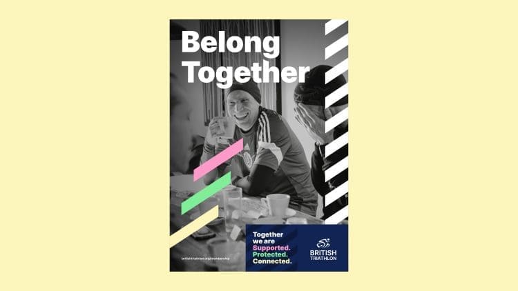
A triathlon involves three starting lines and three finish lines. We knew this key number had to be included in the design. They became a visual motif across all media. Three lines of equal weight and importance in different colours, representing both the three sports of the triathlon and three key brand characteristics and benefits of joining.
These were:
Supported • Protected • Connected
These key elements informed the whole brand, allowing triathletes old, new and potential to feel that the organisation offers an equal level of support, protection and connection to everyone.
They also informed the brand identity along with the initials BT.
The concept was about being connected to a part of something bigger, and a sense of belonging. The B & T of ‘Belong Together’ reflect the B & T of British Triathlon, highlighting how core membership can play a part in fostering the spirit of social communities.
British Canoeing is another UK institution with similar values of inclusion, safety and belonging that need to be on display across all communication.
The British Triathlon logo is versatile, being able to morph into a design for running, swimming or cycling. The look has a sense of excitement and speed, showing the potential of a modern sport that’s surging in popularity.
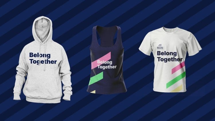
We also developed:
We presented all of these elements to assist British Triathlon with the rebrand rollout across all media. This showed how the new identity worked in practice as well as in theory.
We also produced a video ident to show the Core Membership values in motion. There are three colours, three events and three values, all separate but inextricably linked. Slow-motion shots paired with an intense soundtrack conveyed a reverence and passion for the sport. It was also an opportunity to play with the versatility of the illustrated logo, with it quickly animating between the three sports that make up the triathlon, holding each in equal regard.
We love to work with organisations that promote community, personal growth and achievement, and creatively expressing these ideas is always a satisfying challenge. Overall, we’re proud of the work which came out of this project. The campaign gives a real sense of energy and community, which were key components of the brief but could have been difficult to balance.
