In late 2017 we embarked on a relationship with The Security Company – an international provider of behavioural change and security training to FTSE 100 businesses.
Arch won a pitch to rebrand the company to underpin their strong reputation amongst their client base and support their five-year growth plan.
Watch our video below to see what we achieved.

Central to all the work we carried out was a new visual identity. The original key elements we were tasked with creating were:
To help define the brief and develop a clear design direction we organised a series of stakeholder workshops.
We visited their Huntingdon office soon after winning the pitch to meet with the management team and get under the skin of the business and its staff. We conducted a series of key stakeholder interviews to get an understanding of how the brand was seen internally, and perceived externally.
“The stakeholder management process involved Arch Creative coming into the TSC office and gathering info from all key team members. The interviews were informative and personal and allowed the team to feel involved in the rebranding process. Overall, Arch’s stakeholder management was an invaluable part of this project.”
Aisling Green
TSC Marketing Manager
There were some key features we discerned would need addressing as we reimagined The Security Company:
After taking all of our findings into account, we developed a series of three logo concepts and presented them back to the board.
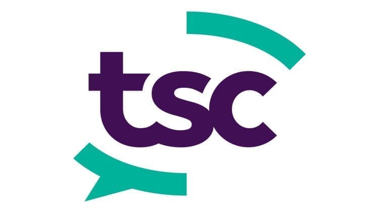
Our concept based on ‘open communication’ was chosen. This option highlighted that TSC is first and foremost a communications agency specialising in security. A minimalist speech bubble with breaks in the outer edge, combined with a fluid conjoined font emphasised this approach resulting in a strong, flexible brand identity.
“We’re delighted with the TSC rebrand. The stakeholder interviews that kicked off the process were an indicator that the Arch team knew exactly what they needed to do to ensure the best possible results. Arch Creative are flexible, reliable and, importantly, an incredibly friendly team. They fit perfectly into the marketing structure at TSC and feel like an extension of my team.”
Aisling Green
TSC Marketing Manager
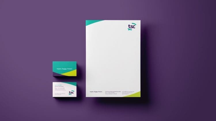
The Brand Guidelines we’ve developed for TSC are a blueprint for how company communications should function across a range of different channels – from picking up the phone in the office to designing and implementing a presentation.
We worked closely with the team at TSC to ensure the guidelines furthered the position the company already held, alongside implementing the new branding look and feel.
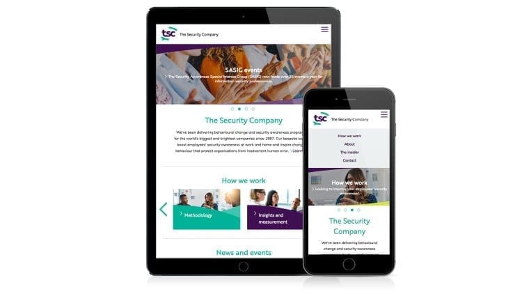
The rebrand went so well that the team also asked us to create new websites for TSC and The SASIG. Utilising the branding, colour palette and tone of voice created during the rebrand the websites were brought to life and giving the TSC sales and marketing team the confidence to redirect customers and clients to the sites.
You can take a look at the new site here.
Using a combination of slick imagery and the TSC curve graphic, we’ve designed and created a site which is easy to navigate, looks great and acts as an excellent sales tool for TSC.
TSC have been an incredible client to work with – they’ve made us feel like part of the team. We’re looking forward to future work with such a great company.
If you’re looking to elevate your brand then get in touch with Arch today.