The rebrand. It’s a tough one to get right – customers get attached to brands just like they do anything else. Do it right, however, and your rebrand can breathe fresh life into a tired company image, revitalise your sales prospects and give your staff and customers confidence in your product. In this article, Arch Creative explore the highs and lows of brand re-creation.
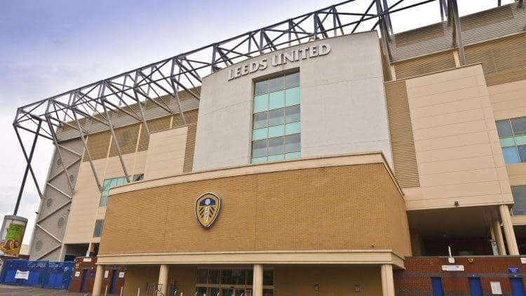
In January 2018, Leeds United FC underwent their own rebrand. It was announced, via Twitter on 24th January at 12:00, that Leeds had a new crest ready to support them over the next 100 years. In a separate Tweet two minutes later, the crest was revealed.
Throughout the afternoon, Leeds fans, marketeers and general onlookers poured scorn onto the new badge. It was likened, and not without reason, to the front cover of PlayStation 2 game Pro Evolution Soccer 2. By 18:00 that evening, another announcement was made, all but retracting the new logo, and promising to consult fans on the re-rebrand to come.
There’s no concrete issue with the Leeds crest. To say “This is a bad logo” is subjective – but can all of Leeds, plus the faceless hordes of the internet, be simultaneously wrong? Maybe it’s the cartoon-esque style of artwork that irritated fans. Cartoons are figures of fun – is that what Leeds are? Maybe it’s the exclusion of the white Yorkshire Rose – a symbol of heritage that goes back half a millennium. Whatever it is, the design of the badge – for the fans, it wasn’t good enough.
Leeds conducted research that incorporated the opinions of 10,000 fans, roughly a third of their regular weekly attendance numbers. Part of the backlash against the design revolves around the amount of time and effort put into it. The fans feel that, given the extensive research, they have been misrepresented.

Leeds have, however, turned it around.
After honouring a change.org petition to retract the badge, Leeds chairman Andrea Radrizzani has made claims that a new badge will be sourced, using the criticism that the first badge received as a starting point. The club, in an expertly organised piece of crisis management, won it’s supporters back by doing the exact opposite of what made them angry in the first place: listening to their feedback and implementing it correctly.
In today’s online climate, one wrong move from a brand will see it ripped to bits on Twitter, Facebook and everywhere in between. More often than not, a brand and the designers associated are wrongfully lambasted for following a brief, their market research and their own creativity. Here are the top things to avoid from your rebrand, with examples of each from the real world.
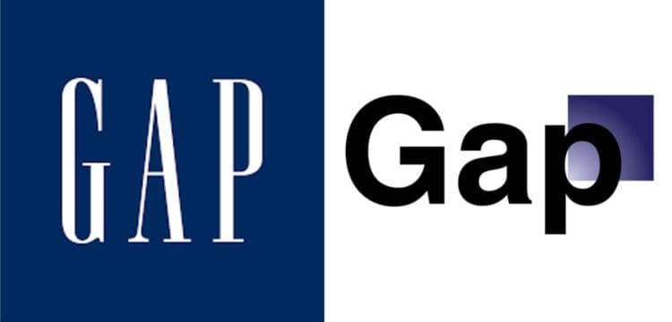
In 2010, Gap, the American clothing retailer, unveiled its new brand. It was swiftly mocked across social media, quite simply because it was “ordinary”. The new logo replaces the famous, elongated serif font for a week, and was then discontinued.
The main issue people took with it was the blue square in the top right corner. It was an obvious throwback to the original brand, but for some reason, it riled customers.
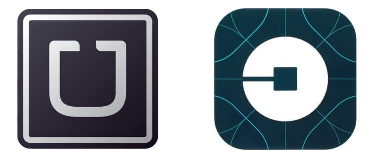
Uber rebranded in 2016, and the logo and general feel of the app is impressive. The former logo, relatively wispy, was replaced with a sturdy, rounded typeface. Each country has a different colour scheme and the overall thought that was put into the branding is impressively thorough.
The issue for customers was the new app icon. They had become used to the simple, white “U”, and were critical of the new version – a white “bit” in front of a colourful geometric pattern. The concern was that it’d be difficult to locate the app when the tile wasn’t so clearly linked to the company logo – especially “when it’s two in the morning and you’re tired and emotional.” As a result of the rebrand, Uber’s head designer Andrew Crow actually stepped down.
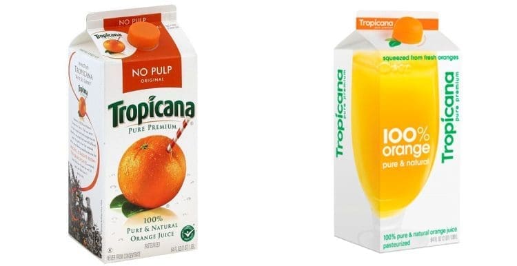
Tropicana rebranded for its North American market in 2009. The move was recalled after a social media backlash from their customers. What looks like a perfectly reasonable, innovative rebrand reviled the North American customer base so much that it cost Tropicana up to $50 million in sales revenue.
An in-depth report into why the project failed revealed the psychological reasons the brands loyal following had rejected the change. Not seeing the classic orange on the packaging was a key factor – the inclusion of a glass of orange juice instead removed the emphasis on freshness the former imagery had.
The design was said to look “cheap” and was too similar to a standard “supermarket’s own” brand. Lastly, the redaction of the copy line “Pure Premium” and its replacement with “100% Orange/Pure and Natural” lead to a perception that the recipe for the juice had changed, and no longer maintained the quality.
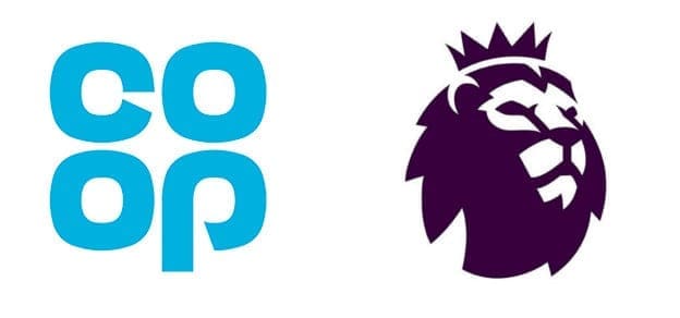
There have been plenty of brand refreshes that have worked out well: The Co-Op re-introduced a classic branding approach to universal applause, for example.
Whilst it received some gentle criticism at first, the Premier League’s new branding in 2016 has generally been well received from a design perspective.
Yes, it had its fair share of ribbing on Twitter, but it seems par for the course these days that anything that represents change will get a bashing online.
Maybe the real challenge isn’t the rebrand, but the crisis management that ensues. The Premier League simply ignored the small amount of vitriol from wannabe comedians on social media and marched on with a rebrand that is now as familiar to fans as the old imagery ever was.
To finish, Arch Creative carried out a rebrand towards the end of 2017. Subtle changes to our logo and big changes to our colour scheme meant that we maintained a core part of our identity, whilst offering a fresh perspective on our brand. Of course, we didn’t just change our logomarks and colours – we revamped our website and even repainted our office to suit the new look. The start of 2018 saw a flurry of new business, and our new branding prompted a spike in website visits.
If anyone from Leeds United is giving this blog a read – we’re positive we can get a new crest turned around by the end of February. Give us a call.